
Venice
Vein Cut Travertine In Porcelain Tile.
Venice
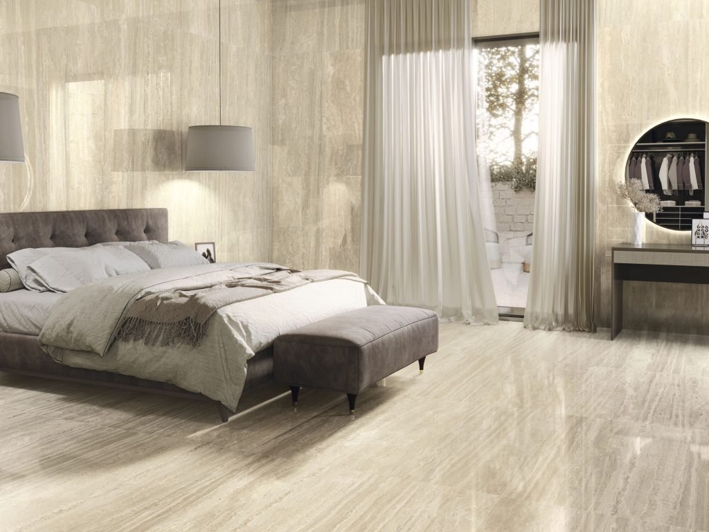
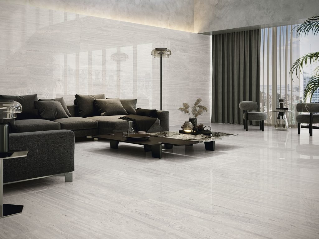
Venice showcases the elegant linear veining of vein-cut travertine in a practical porcelain format. The collection offers warm, natural tones that bring Mediterranean elegance to any space.
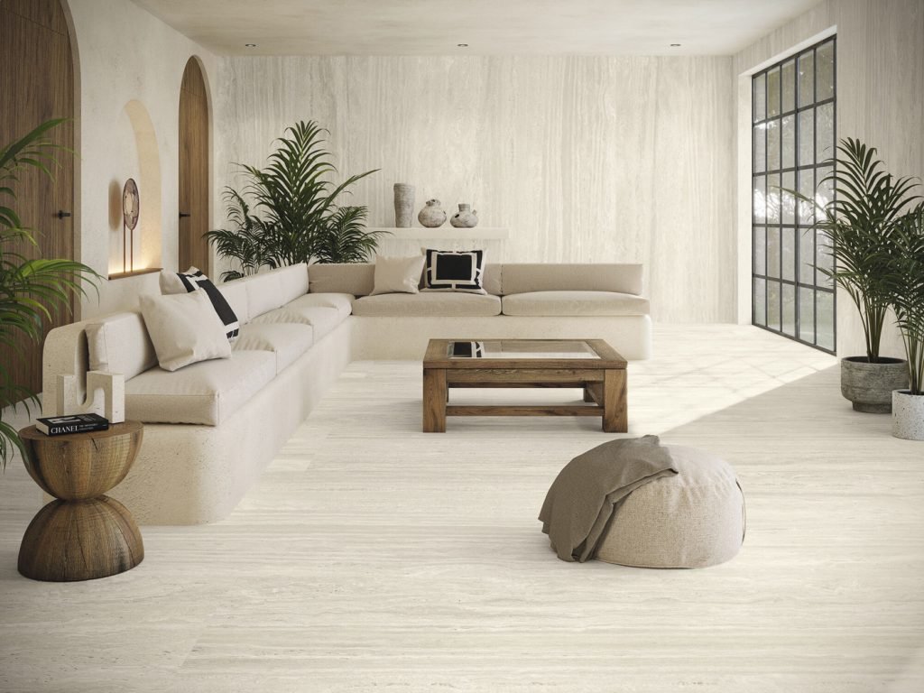
Linear banding is the signature of vein-cut travertine, and Venice carries it across large-format porcelain in four colourways: Bianco, Beige, Miele and Grigio. The stripes run the length of each tile, so orientation becomes a design decision, horizontal bands to stretch a wall wide, vertical to draw the eye upward. Faces are non-repeating, keeping long runs organic.
Porcelain construction means the linear beauty comes without travertine's filling, pitting and sealing routine. Venice is offered in a natural finish for floors and everyday surfaces and a polished finish that gives walls a honed-and-buffed stone glow. It suits Metro Vancouver bathrooms, feature walls and modern interiors that lean on horizontal lines.
Specifications
Colors & Variations
Face Variations
Click any tile face to view in detail
Applications
Where Venice Works
Directional feature walls
Run the banding horizontally behind a vanity or media unit to visually widen the room. The polished finish deepens the linear pattern under wall-mounted lighting.
Bathroom walls and floors
Natural finish on the floor keeps traction sensible, while the same colourway polished on the walls adds light. Banding aligned from wall to floor looks tailored.
Contemporary living areas
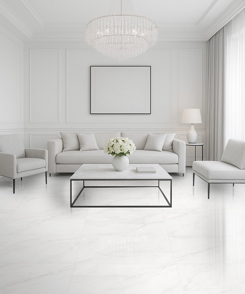
Vein-cut patterning complements modern architecture built on strong horizontal lines. Laid in 24x48, Grigio or Bianco floors read crisp and architectural rather than rustic or old-world.
Corridors and lobbies
Linear veining running down a corridor draws the eye forward and makes narrow spaces feel longer, while the porcelain surface stands up to years of concentrated foot traffic.
Design Notes
Pairing & Layout Ideas
Venice rewards alignment: plan the banding direction before ordering, and carry it consistently through the space. Slatted wood panels, linear drain covers and long, thin mosaics reinforce the horizontal theme. Miele pairs with brass and walnut, Grigio with black and concrete tones. Match grout carefully to the tile's base colour so joints disappear into the bands. For the rounded, cloudier version of this stone, Florence is the cross-cut counterpart.
FAQ
Venice Questions
What is the difference between Venice and Florence?
Both are travertine look porcelain in the same four colourways, but Venice models vein-cut stone with linear stripes while Florence models cross-cut stone with soft, cloudy swirls. Choose Venice for a tailored, directional look and Florence for a softer, more organic one.
Should the bands run vertically or horizontally?
Horizontal runs make walls feel wider and suit long feature walls and wainscots. Vertical runs add height to small bathrooms and stairwells. On floors, run the bands along the room's longest dimension. Decide before ordering so your installer can plan cuts around the direction.
Is the polished finish okay for floors?
In dry areas, yes. For bathrooms, entries and kitchens we recommend the natural finish, which grips better when wet. A common approach is natural on all floors and polished reserved for walls, where its light-catching surface does the visual work.
Do I need to seal or fill it like real travertine?
No. Real vein-cut travertine often arrives filled and needs periodic sealing as the fill wears. Venice is porcelain through and through: no pores, no fill to maintain, no sealing schedule. Routine cleaning is a sweep and a damp mop with neutral cleaner.
Visit Our Richmond Showroom
Experience the difference of seeing and touching our materials in person.