
Cashmere
Soft Stone Look In Porcelain Tile.
Cashmere
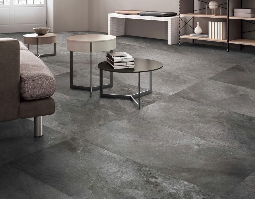
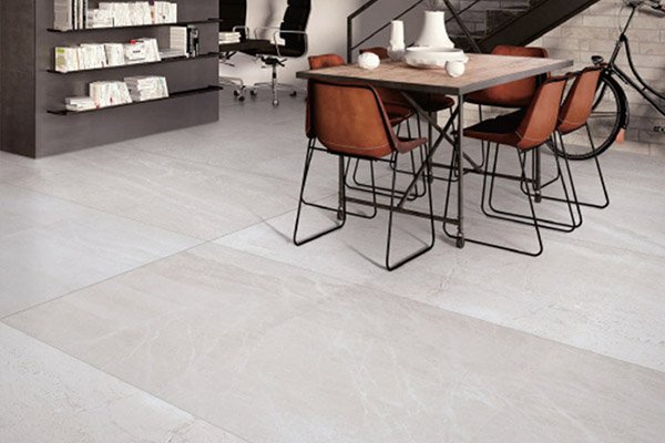
Cashmere delivers a soft, tactile stone aesthetic in a low-maintenance porcelain format.
The name signals the intent: Cashmere is a stone look chosen for softness, with a gentle, diffuse mineral pattern and a smooth matte surface across four colourways, White, Cream, Grey and Charcoal. There are no bold veins or heavy texture here, just quiet tonal movement printed in non-repeating faces that keep large floors looking natural.
Because the body is porcelain, the soft look carries hard-surface performance: stain resistance, scratch resistance and zero sealing for the life of the floor. Cashmere suits Metro Vancouver bedrooms, living areas and bathrooms where comfort is the brief, and its warm and cool neutrals cover both cream-based and grey-based interior palettes.
Specifications
Colors & Variations
Face Variations
Click any tile face to view in detail
Applications
Where Cashmere Works
Serene living floors
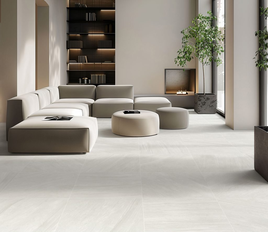
A diffuse pattern in Cream or White gives open living areas warmth without visual noise, letting furniture, art and the views beyond the windows do the talking.
Cozy bathrooms
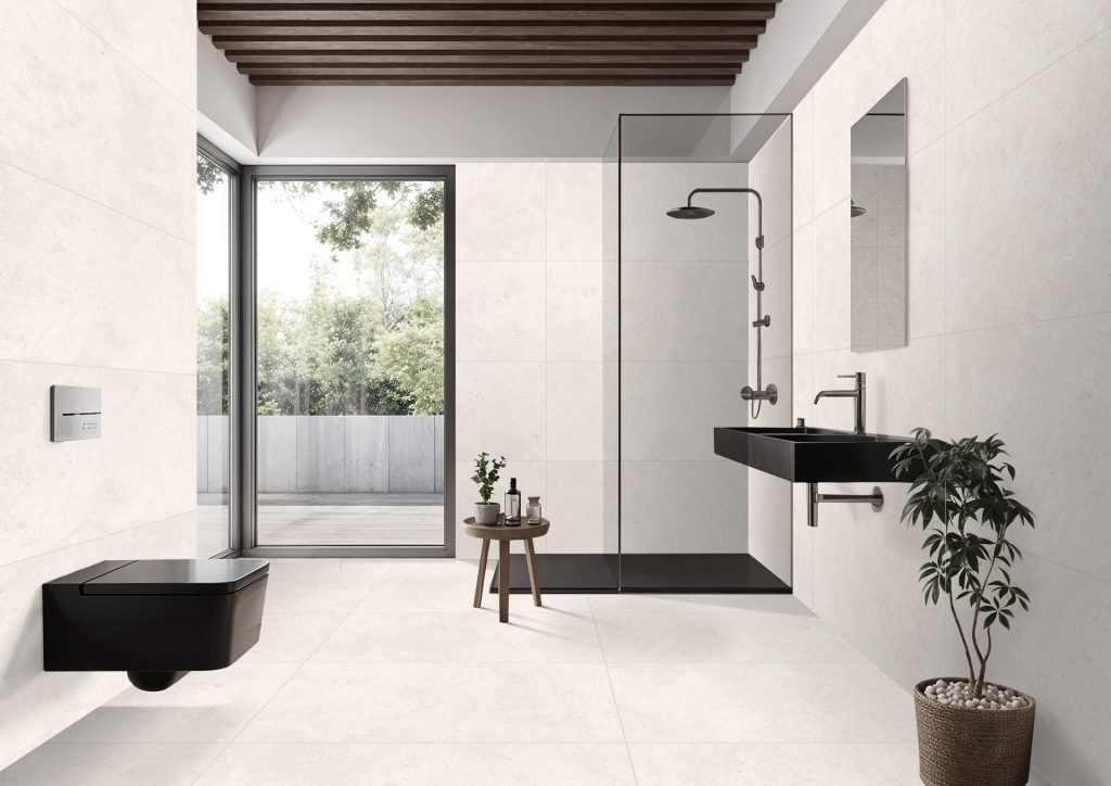
Matte porcelain in a soft stone pattern makes a bathroom feel warm rather than clinical, and the low-sheen finish keeps traction sensible on wet weekday mornings.
Bedrooms over radiant heat
Tile in bedrooms makes sense once radiant heat is involved, and porcelain conducts it efficiently. Cashmere's softness suits restful rooms better than glossy stone looks would.
Charcoal accent spaces
The deep Charcoal colourway grounds powder rooms, fireplace surrounds and entry floors, providing depth while the gentle mineral pattern keeps the dark surface from reading flat.
Design Notes
Pairing & Layout Ideas
Cashmere plays the supporting role by design, so bring the texture through furnishings: wool rugs, linen drapery, boucle seating and matte wood finishes. Cream and White accept brass warmly; Grey and Charcoal favour black or pewter hardware. Matching grout preserves the soft, continuous read. If you are choosing between quiet stone looks, compare it against Terravena, its travertine-based counterpart, and Solaro, which adds a touch more visible grain.
FAQ
Cashmere Questions
What makes Cashmere different from other stone looks?
Its restraint. Most stone look tiles emphasize veining or aggregate; Cashmere keeps pattern diffuse and tonal, closer to a soft textile than a dramatic slab. Choose it when you want a floor that supports a room's design instead of starring in it.
Warm or cool: which colourways are which?
Cream and White sit on the warm side and flatter wood tones and brass; Grey and Charcoal are cooler and suit black fixtures and modern schemes. All four share the same pattern and sizes, so mixing warm and cool between rooms still looks intentional.
Is it durable enough for an entryway?
Yes. Despite the soft appearance, this is 1cm porcelain, the same class of material used in commercial floors. It resists scratching from grit, will not stain from wet boots, and cleans with a damp mop. The Charcoal and Grey tones are especially forgiving at the door.
How do I get samples?
Drop by the Richmond showroom at #3-11240 Bridgeport Rd, walk-ins welcome, and borrow the colourways you are considering. Subtle tiles like Cashmere read differently under home lighting than showroom lighting, so we always suggest viewing samples in your own space.
Visit Our Richmond Showroom
Experience the difference of seeing and touching our materials in person.