
Balance Stone
Pure white stone aesthetic in porcelain.
Balance Stone
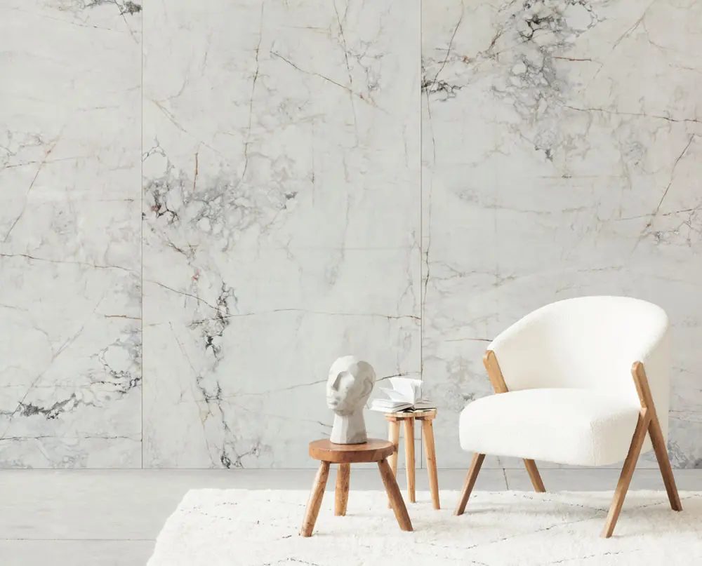
Balance Stone offers a clean, contemporary white stone aesthetic in a versatile porcelain format. The subtle veining and soft texture create a calm, balanced atmosphere perfect for modern bathrooms, kitchens, and living spaces.
Calm is the entire brief for Balance Stone. A white stone face with faint veining and soft texture, it comes in White and Grey with a choice of matte or polished finishes across 24x24 and 24x48 formats. Faces are non-repeating, so walls and floors keep a natural, unforced quality even in large, minimal rooms.
As an 8mm Polish glazed porcelain for indoor floors and walls, it carries no sealing requirements and shrugs off bathroom products, cooking spills and daily traffic. Balance Stone suits the bright, pared-back interiors common in newer Metro Vancouver builds: pick matte for floors and wet rooms, and reserve polished for walls where its light reflection earns its keep.
Specifications
Colors & Variations
Face Variations
Click any tile face to view in detail
Applications
Where Balance Stone Works
Serene primary bathrooms
Matte White across floor and walls builds the quiet, light-filled bathroom this collection is named for. Add the polished finish on a vanity wall for gentle contrast.
Kitchen floors and backsplashes
The subtle veining adds just enough life to large kitchen floors, while a polished 24x48 backsplash bounces daylight deeper into the room and wipes down in seconds.
Compact condo bathrooms
White in 24x48 stretches small rooms; fewer grout lines and a pale, continuous surface visually push the walls apart. The matte finish keeps the floor sensible when wet.
Polished feature walls
Behind a soaker tub or bed, polished Grey gives soft sheen without heavy veining, catching lamplight in the evening while staying quiet and understated by day.
Design Notes
Pairing & Layout Ideas
Balance Stone plays the supporting role well: pair it with wood tones from white oak to walnut, soft white paint and simple chrome or black fixtures. It coordinates naturally with the bolder veining of Calacatta CX if you want one quiet and one expressive surface in the same bathroom, and Grey ties into concrete looks like Artport across a larger project. Match grout to tile on the polished finish especially, where contrasting lines would interrupt the sheen.
FAQ
Balance Stone Questions
Matte or polished: which finish where?
Matte for any floor that sees water, including bathrooms, entries and kitchens, because it offers more traction. Polished belongs on walls, backsplashes and dry feature areas where reflection adds light. Many projects use both finishes in the same colour to zone a room.
Is the veining strong or subtle?
Subtle. Balance Stone is designed as a calm background surface, with faint veining and soft texture rather than dramatic movement. If you are after bold statement veining, you would look at a Calacatta style collection instead; this one is built for serenity.
Will White and Grey work together in one room?
Yes, they share the same face pattern and texture, so combinations feel intentional: Grey floors under White walls is a common pairing. Because both come in matte and polished, you can also split finishes rather than colours to create the contrast.
How do I judge the polished finish before buying?
Reflective finishes are hard to assess from photos, so we suggest seeing full tiles at our Richmond showroom, where displays show polished and matte side by side under realistic lighting. Bring your paint and cabinet samples to test the whites against each other.
Visit Our Richmond Showroom
Experience the difference of seeing and touching our materials in person.