
Imperial Royal Crema
Golden Cream Marble In Porcelain Tiles.
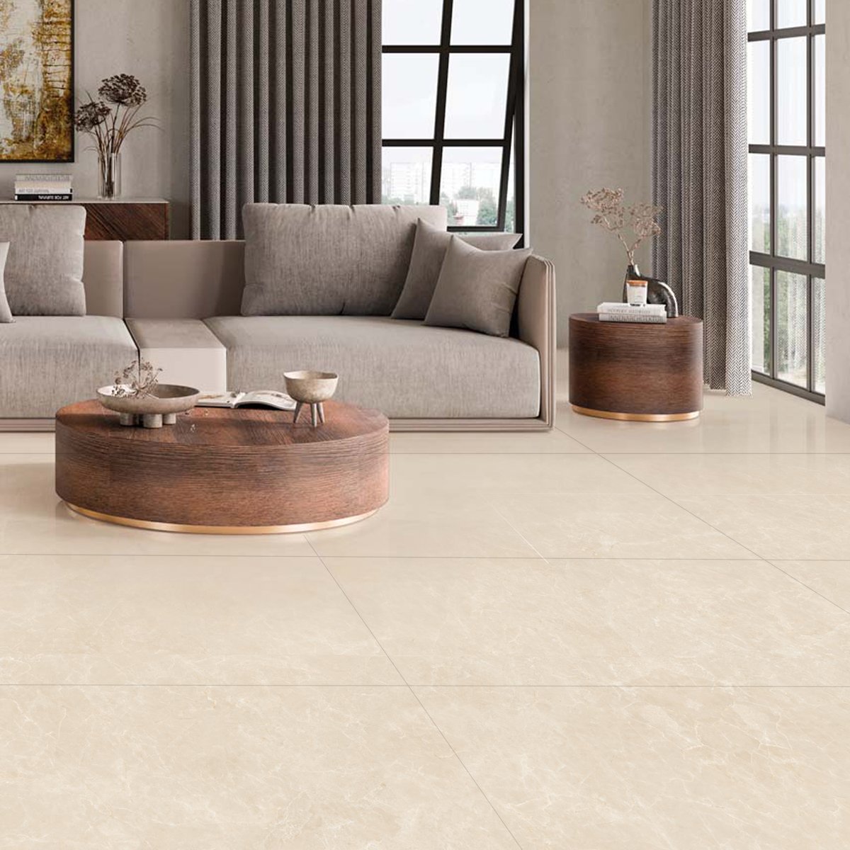
Imperial Royal Crema
Imperial Royal Crema replicates the warm, creamy tones and golden undertones of premium Italian marble. The subtle veining and rich cream palette create a timeless elegance suitable for luxurious bathrooms and grand living spaces.
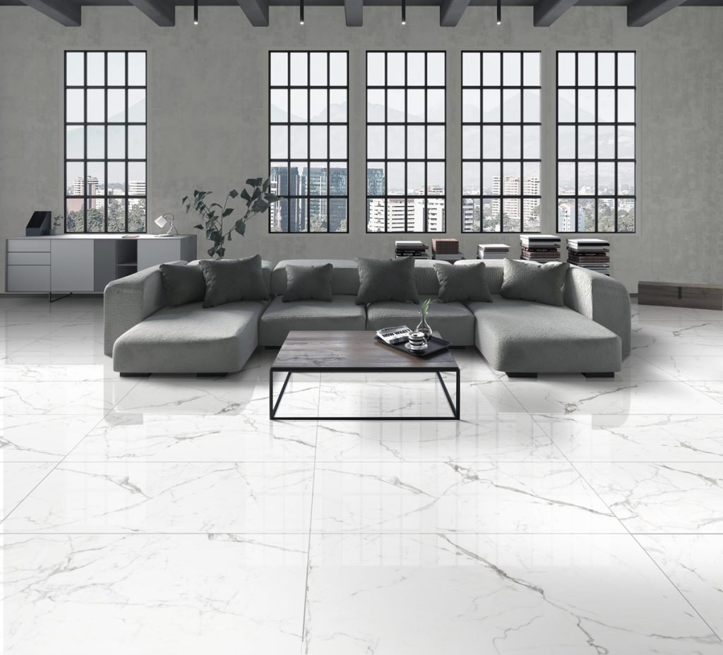
Imperial Royal Crema takes its cue from the warm cream marbles of Italy, with soft golden undertones and gentle veining spread across eight non-repeating face styles. The result is quieter than a white Calacatta look: less contrast, more warmth. Polished tiles bring out the honeyed depth of the colour, while matte reads closer to honed natural stone.
Porcelain construction means the cream surface stays cream: nothing soaks in, nothing needs sealing, and stains from daily life stay on the surface where they wipe away. In Metro Vancouver homes it suits traditional and transitional interiors, warm-toned kitchens and bathrooms, and any project where grey-heavy palettes feel too cold for comfort.
Specifications
Colors & Variations
Face Variations
Click any tile face to view in detail
Applications
Where Imperial Royal Crema Works
Warm-toned bathrooms
Cream tile keeps a bathroom from feeling clinical. Use matte on the floor for traction and polished on the walls to bounce light around rooms with limited natural windows.
Living and dining floors
The 24x48 format runs veining continuously through connected living spaces, and the forgiving cream colour hides everyday dust better than stark white or dark floors do.
Traditional kitchens
Golden undertones sit naturally alongside shaker cabinetry, warm stone countertops and brass hardware. A 24x24 grid layout gives the classic look these kitchens usually call for.
Hotel-style ensuites
Wrap the floor and walls in a single material for a calm, enveloping ensuite. Eight face styles keep long wall runs from showing an obvious repeat.
Design Notes
Pairing & Layout Ideas
Build around warmth: brass or aged gold fixtures, cream or taupe paint, walnut or oak cabinetry, and textiles in ochre and rust all sit comfortably with this palette. Choose a warm ivory grout rather than bright white, which can make cream tile look dingy by comparison. If you want to see how it compares to whiter marble looks, put it next to Goya or Tubac, the warmth becomes obvious immediately.
FAQ
Imperial Royal Crema Questions
Will cream tile make my space look dated?
Not in this format. Large 24x48 panels, subtle veining and a rectangular layout read as current, while the warm palette keeps the room inviting. Cream works especially well now as a counterpoint to the grey interiors of the past decade.
Which rooms suit Imperial Royal Crema?
It shines in bathrooms, kitchens and main living floors where you want warmth without pattern overload. Because the veining is gentle, it also works across large areas without becoming busy, which makes it a strong whole-main-floor candidate.
Polished or matte for a kitchen?
Matte on the floor, polished anywhere vertical. Kitchen floors see water, oil and dropped food, and matte gives better grip while hiding fine wear. On a backsplash or island face, polished adds light and is just as easy to wipe down.
How does it handle in-floor heating?
Very well. Porcelain conducts and holds warmth efficiently, and it is dimensionally stable over radiant systems, so heated bathroom or kitchen floors are a natural fit. Your installer just needs an appropriate flexible thinset over the heating membrane.
Visit Our Richmond Showroom
Experience the difference of seeing and touching our materials in person.